Pantone, the leader in colour trends around the world, released the colour of the year for 2015.
This was a few months ago and you might recognise it as it trickles its way through design & fashion. Now how the powers that be, Pantone in this case, select the “Colour of the Year” each year is a very complicated and scientific process (if you really need to know there are videos, interviews etc for you to research on the www.pantone.com). I personally have just accepted that this is the colour and dive straight into how I can apply this colour to my interior design.
If you are wondering why you would use such a bold statement in your home Leatrice Eiseman, Executive Director of Pantone Color Institute says:
“Marsala is a subtly seductive shade, one that draws us in to its embracing warmth”
In fact, Pantone list several reasons as to why you should use Marsala in your home design. Pantone suggests that Marsala is versatile, by being equally appealing to both men & women, dramatic, yet grounding offering warmth and an earthy sophistication.
Here are a few of my favourite uses of this colour, one that certainly didn’t appeal to me at first but has grown on me, and dare I say it; converted me!
You decide for yourself.
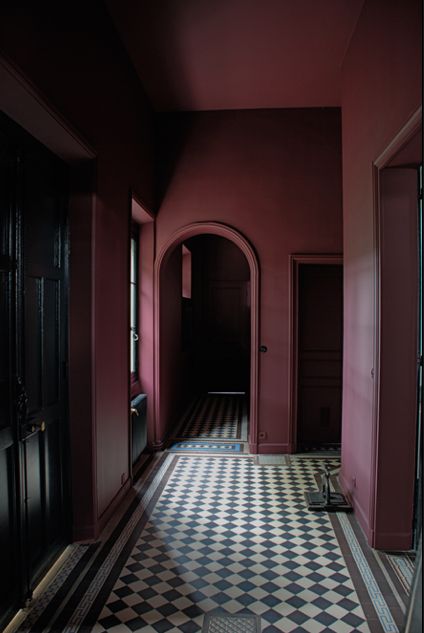
DRAMATIC
Drunk on marsala in this drama filled space.
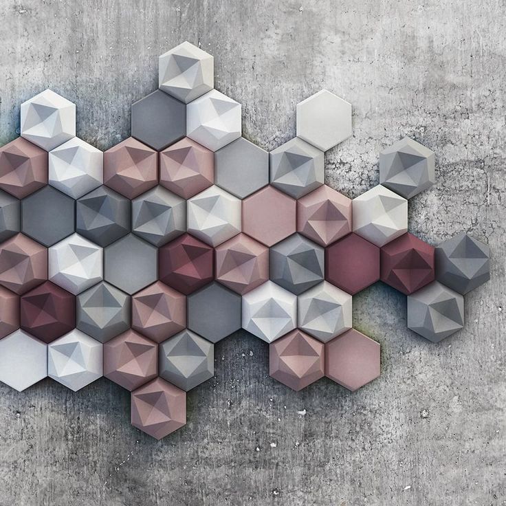
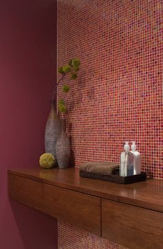
SUBTLE
This geometric tile offers subtle hint of marsala, marsala tones, and muted greys and whites
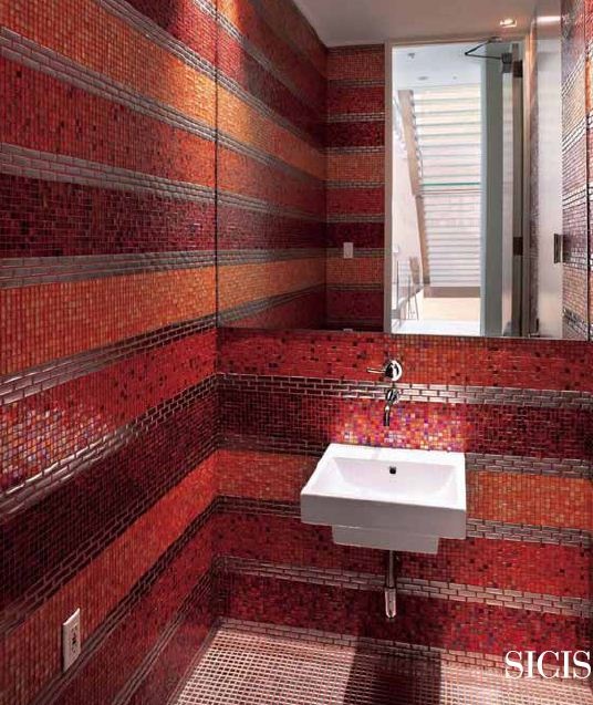
FEATURE
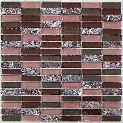
MODERN
Find this post valuable?
Say a simple thanks by liking – or cruise down to the comments section & share a thought…
TILE junket showcase the best tiles available in Australia from around the globe, right here in Geelong.
Book your showroom complimentary Concept Consult for interior design assistance for your tile project.