Read Paulina Bird’s (House of Bird) insights into the 6 Principles of Design and how applying these principles can influence a successful design and create beautiful spaces. This Six Part Series breaks the design mystery down to its most simple and most easily understood elements – a must for any design enthusiast.
We are all familiar with the term Tension.
It can describe a really bad headache or the stress we feel in a job that needs to be performed quickly. The words worry, rigidity, conflict and pressure come to mind in describing Tension. But what is it doing appearing in a Design Blog claiming to be a Design Principle?
TENSION
It has to play a vital role to earn the merit of inclusion. It is also described as a force created through stretching or pulling the interplay of conflicting Elements. Yes, it sounds complicated but I guarantee you have been creating Tension in your design schemes without ever being aware of what it is and how it interplays.
Lets take a look at an example.
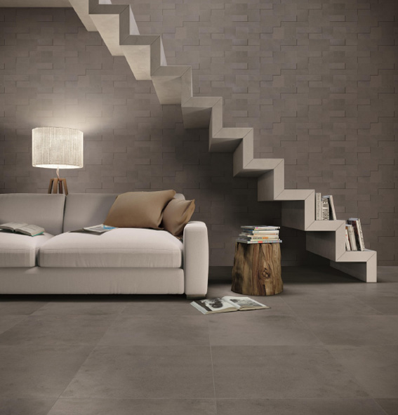
In this simple room below the one element that screams for attention is the stunning staircase. Yes it’s a dominant feature but it also adds a visual dynamic that is called directional Tension. So to sum the staircase up, it is Dominant, it adds Tension and is Rhythmic while adding Movement to the room. These Principles are all delightfully at play with each other. Being such a skilful and eye catching statement, it does not need too much else to make the room work. Cleverly the Room is simply styled so the beautiful staircase can remain the star. This is superb design and I am glad that the tiled mosaic feature wall is making a subtle background statement adding stability while it also softens the movement of the stairs. The concrete floor tiles enhance and blend in well with the wall tiles. The furniture is kept simple and stylish so it doesn’t take from the stairs and feature wall and works well in complimenting the finished look.

The above design is also a staircase scheme and I have included it in this Blog post because the Tension is not only in the staircase but also in dynamic artwork and dining setting. The contrast between the two add to this Tension as well as the use of repeating lines in the stairs verses softer forms used in the curves of the chairs and artwork. Tension therefore is highlighted by opposites and it works very cleverly in capturing our attention.
My Design artwork above is called Araldo T2 k. and is available in a few sizes. It demonstrates Tension by off setting the use of colour in the zigzag. This pulls your eye from arrow to arrow adding stress and interest and is available in few colour way options. You can contact me by email if interested in purchasing my designs at [email protected].
In the Room above the Tension is in the patterned mosaic wall, yet the two sets of columns also add an interesting dynamic. The greater the conflict the greater the Tension so being asymmetrical placed, the columns add more Tension to this room. This just makes this room so much more interesting.
An asymmetrical scheme has to be balanced to succeed. Get it wrong and yes again, it is a disaster. The furniture placement is spot on because it counteracts and compensates for the Tension acting out between the mosaic wall and the unbalanced columns. This is a clever way of adding balance to an asymmetrical scheme. It works wonderfully causing your eye to travel around the room linking all elements and diversity. I just love the circular glass table and the concrete tiles on the floors as they stabilize all the elements together.
Tension is a balance maintained in an artistic work between opposing forces and elements. It is building a pattern of stress then releasing it. Tension and releases is at the heart of music, story, art and all creative endeavours. It’s what makes the design alive and exciting. Contrast of light & dark, large & small, curves & straight all add Tension also and are opposing forces. Use Tension sparingly as like dominance, too much and the eye pulls in all direction. If it is correctly used then it adds energy, stress and a visual weight which all equates to a fabulous Design.
Happy Designing.
By Paulina Bird
Links to all six parts: Design Principles – 1 Balance (Series, 1 of 6), Design Principles – 2 Rhythm (Series, 2 of 6), Design Principles – 3 Movement (Series, 3 of 6), Design Principles – 4 Stability (Series, 4 of 6), Design Principles – 5 Dominance (Series, 5 of 6), Design Principles – 6 Tension (Series, 6 of 6).
Explore our showroom for yourself – 2a Gordon Avenue Geelong West. You can also book your no obligation complimentary appointment with our design team – learn more about our Concept Consult here.
Follow TILEjunket on your favourite social media hubs for more trends and tips.